

Healthcare marketers using Freshpaint’s Attribution feature had all the data they needed and no clear next step. Recommendation Cards was built to close that gap, surfacing a specific, ranked action every week instead of a table to interpret. Here’s how it was designed, and what happened after it shipped.
Context
Recommendation Cards is a feature I designed at Freshpaint, living inside Attribution, the tool healthcare marketers use to see how their ad spend is performing across channels and where attribution credit is landing. Each card makes a specific claim, backs it with a number, and closes with a single recommended action. It also carries a category badge: Channel Performance, Funnel & Journey, Budget, and others, so a marketer can tell at a glance what kind of signal they're looking at.

Category
Tags the signal type at a glance, before the marketer reads a word.
Claim
States a concrete finding plainly instead of leaving the marketer to interpret raw data.
Attribution model
Discloses which model produced the recommendation, since different models can disagree.
Recommended action
States a clear, actionable recommendation for the user to take.
Feedback mechanism
Lets the marketer flag whether the recommendation was useful, giving the team a signal to tune future cards against.
Before I worked at Freshpaint, I designed Recommendation Cards, sort of by accident. The final stage of my interview process included a take-home design exercise: no mention of Recommendation Cards, no feature spec. Just a brief describing a healthcare marketing lead drowning in data spread across disconnected systems, unable to get a clear read on what was working without deep technical help.
The task was to design something that let that person explore their own data and act on it with confidence, however I saw fit.
An artifact from my original design challenge submission for my interview at Freshpaint. Framing the problem and understanding the user.
I called my concept Pulse. The scenario I built centered on a marketing manager who didn't need more data, she needed more confidence in the data she already had. Pulse surfaced that confidence through a feed of insight cards that explained to her how her channels are performing and what to do about them in a way she can understand, act on, and share. The response to this concept was strong enough to become one of the deciding factors in getting me hired onto the exact team that would go on to build it for real. Months later, that same core idea would go on to become a living feature inside the Freshpaint ecosystem.


Freshpaint customers were working across three, four, sometimes five disconnected marketing sources, and the numbers frequently didn't agree with each other. Even the sharpest customers, the ones who loved a good table or chart, still had to do real legwork to turn that data into a decision, because no platform is ever going to tell you to move budget away from itself. Other customers didn't have the time or inclination to dig through that data at all, so patterns that should have changed their spend went unnoticed for weeks.

Same campaign, same week. Three ad platforms, three different conversion counts
Both user types shared a second problem. Most customers checked in weekly, sometimes closer to biweekly. One insight, generated early in our discovery process, caught a channel with zero completed orders over 30 days, a broken conversion event nobody had noticed. On a biweekly login cadence, that gap could sit unnoticed for a full cycle. It's a month of budget spent against something that was never going to convert.

An early insight generated directly from customer data
1
The standup
Freshpaint's feature set is divided among several color-themed teams, like Tangerine, Celeste, and Lavender. I was assigned to Team Indigo, the stewards of Attribution, and brought up to speed on their roadmap for the quarter during one of my first 9:30am standup meetings. Three projects stood at the top: Group By Campaigns, Paid & Unpaid Sources, and Insight Cards. I took a cursory glance at the PRDs from each, and one stood out. Insight Cards looked strikingly similar to what I had created for my design challenge. Along with the PRD came a rough mockup, early ideas from the PM meant to help get the ball rolling. While the resemblance was clear, this version was simpler: a single card type, rather than the three I had proposed. Either way, it appeared I already had a head start on this project. Better still, it was next in line to get built.

An early mockup based on the initial PRD, insight cards without categories or recommended actions.
2
Studying the PRD
The PRD was the north star, but that didn't mean it was set in stone. Before proposing anything, I wanted to understand where the data was coming from, what the real constraints were, and whether there was room to suggest enhancements, rather than pitch an idea that would blow up scope before we'd even started. I met with the PM and Eng team to work through it together, separating what was fixed from what had wiggle room, then pitched bringing back all three of my original card types. It was a show, don't tell pitch. The idea landed. I got the green light to explore, and while Eng sized the lift, I turned to the data to see if it could actually justify the card types I'd proposed.

Budget

Broken Signal

Efficiency Surge

Channel Win

Efficiency Gap

Portfolio Rebalance
❖ Category Badges V1 – my initial synthesis
Budget
Portfolio
Channel role
Channel performance
Attribution
Funnel & Journey
Trend
Other
❖ Category Badges V2 – after refining with the data team
My initial synthesis (V1), refined into the eight-category system (V2) after partnering with the data team
Proposed: three card types

Agreed direction: one card type

Two directions from the design review: three distinct card types (single metric, comparison, recommendation), and the single recommendation card, with categories, that we ultimately agreed on
We reached out to our customer base and identified four candidates for our first round of testing. Before each session, I preloaded the prototype with the participant's own data so the recommendations they saw weren't hypothetical, they were real.
More than once, someone stopped mid-session and asked, 'is this our actual data?' It was. Some lit up at numbers they didn't expect. Others found something they didn't love, and were glad to know it now instead of months from now.
USER TESTING CANDIDATE 1:
"WOW. I mean, this is a game changer. Honestly"
USER TESTING CANDIDATE 2:
"You have data and recommendations across [multiple] platforms. There is nowhere else where you have this type of data. Neither of the ad platforms individually is going to give me this. Meta is certainly not going to tell you to cut budget, let alone where to send it to."
Testing continued over the next two weeks. Overall, user responses validated the concept. One tester compared the drilldown flyout to Google Ads' UX, and said the supporting data gave them enough confidence to act on it. We did receive minor actionable feedback. Since the cards are filter-agnostic, it wasn't clear which attribution model the recommendation was built on. Another tester wanted their defined conversion events surfaced in the drilldown drawer, to confirm which one was behind each CPA metric. Beyond that, the original design held up as-is.
A couple of requests didn't make the cut. Some wanted a CTA in the flyout to act on the recommendation directly. It was appealing in theory, but out of scope and hard to get right without overpromising what it could do. We also heard a request to regenerate recommendations under a different attribution model, but that wasn't feasible either, since cards take a full day to generate once data is ingested. Nothing about that could happen live.
What shipped had more value than the original concept, but was still simple by design. A singular card type with a headline with a key finding, a recommendation, and a category badge for quick scanning. Click it, and a drawer opens revealing the full picture, supporting data, and the conversion events driving it. Plus a thumbs up or down on every card, so every bit of feedback could inform how future recommendations were generated. The conversion events in that drawer weren't part of the original plan, they were a direct response to what we heard in testing.
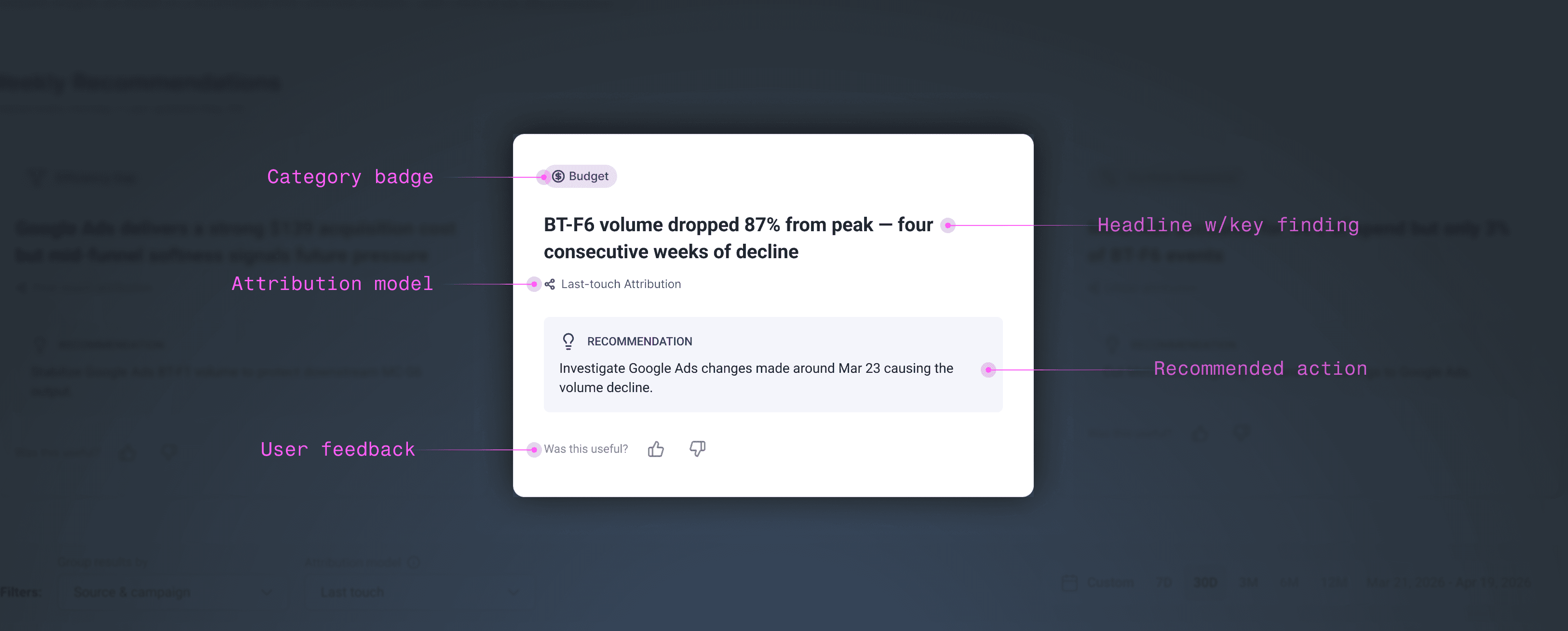
The final card, annotated: a category badge, headline with a key finding, the recommended action, and a way to track user feedback
Clicking a card opens the drilldown drawer, giving customers the supporting data and conversion events behind each recommendation.
Several testers asked to see conversion events. The question then became how to show them well. Some customers track a single conversion event, others track over a dozen. I pulled the actual distribution from Snowflake, then built a small utility panel to stress-test my layout against the full range, from the simplest case to the messiest, so the design held up no matter how much data someone had.
A quick tool I built to stress-test the conversion-event layout against real customer data, from a single event to over a dozen, so the design held up no matter how much or how little data someone had.
Following a round or two of design QA to confirm the execution matched spec, Recommendation Cards launched on schedule, on May 28th, 2026. We showed it off at that week's company all-hands, including clips from the testing sessions. We were excited to finally get it into customers' hands and see how they'd put it to use. Coming out of the retro, we set a plan to revisit the numbers in a month, to see how it was performing across our user base.
What we launched wasn't AI for the sake of having AI in the product. It closed a real gap in our customers' tech stack, giving them a view into their data they'd never had before: an unbiased read on how their initiatives were performing, and what to do about it. Best of all, it had already been tested and validated with real customer feedback and real user data, so we knew we were built something people actually wanted.
In accordance with the plan we'd set, the whole team kept an eye on the Looker dashboard over the following month. We tracked a few key metrics, starting with how many customers enabled AI, a required step before we could generate any cards for them. From there we watched engagement: card views, drawer clicks, and feedback submissions.
AI adoption was healthy. We saw it firsthand on customer calls too, watching them navigate to Attribution and land right on the cards. Engagement with the cards themselves told a different story. We'd set an early goal of at least half of all recommendations getting a thumbs up, a deliberately modest bar meant to confirm the model's output was useful before expecting anyone to act on it. We came in well under that. Card clicks were low, and thumbs up/down submissions were even lower. A couple of weeks in, we talked through the early numbers but held off on any real conclusions until the full month had passed.
Once that trend held, I started digging into why. I'd had some distance from the cards since designing them, which gave me a chance to look at the experience with fresh eyes. I ran through a few scenarios and landed on five hypotheses.
HYPOTHESIS #1
Low click rates might actually indicate cards are already doing their job.
The headline and recommendation may deliver enough value on their own, the drawer exists mainly for people who want the proof behind it. If click-through itself needed to be the success metric, the card would need to show less up front and require the click to unlock the full recommendation.
HYPOTHESIS #2
Low engagement with the thumbs up/down warrants direct user interviews, not just more data-watching.
Feedback timing may be part of it: cards regenerate weekly, so by the time a recommendation proves right or wrong, the card that prompted it is often already gone. Worth understanding when and why users actually would rate a card.
HYPOTHESIS #3
The card doesn't clearly signal it's clickable
While the card has a hover state, that alone isn't enough of a cue. A "View details" affordance on hover could make the interaction more obvious.
HYPOTHESIS #4
The moment someone forms a real opinion on a recommendation may happen inside the drawer, not on the card.
Duplicating the thumbs up/down there could catch feedback that never gets given on the compact view.
HYPOTHESIS #5
Card clicks and thumbs ratings might not be the right signal for real-world impact at all.
A better measure could be following up directly. A smart check-in system triggered by engagement, a click, a thumbs rating, any signal of interest, could prompt a follow-up a week later asking if they acted on it. It's also worth revisiting the action-button idea we passed on during testing: if we built it, clicking it could double as a signal that someone was ready to act.
Underneath most of these hypotheses is a bigger question, whether clicks and thumbs were ever the right thing to watch. Talking it through with our PM afterward, the real goal was never engagement for its own sake. It was giving people recommendations that move a metric they actually care about, something like ROAS. Clicks and feedback were a proxy for that, a way to check the model was landing before we could measure the real outcome. If the recommendations are useful enough that people just act on them without clicking through or rating them, that's not necessarily a failure. It might be the feature working the way it was supposed to.
At this point, I was fueled by genuine curiosity, eager to follow up with customers and dig into their experience with the cards. Before I could, Freshpaint was hit with a wave of layoffs, and unfortunately I was affected by it. I still think about how this one plays out, and I'd love the chance to find out.
Looking back, what stands out to me isn't the cards themselves. It's how consistently I let real data settle an argument instead of my own instincts. Almost every real decision in this project, from which card types survived to how many events might show up in a drawer, got checked against something real before it shipped. And that wasn't a one-off habit for this feature. It's become how I default to working. Data over assumption, every time.
There's also something worth saying about ending a story without a bow on it. Most case studies wrap clean. This one doesn't, and I'd rather leave it that way than force a resolution I don't actually have. In my experience I've found that good product work rarely finishes the moment the person doing it walks away. Mine just ended earlier than I would have liked.