
User Interviews
Wireframes
Prototyping
User Testing
Product Design
Interaction Design
Dev Support

Context & Stakes
Viewer personalization had been one of Tiled's key differentiators since its introduction. The feature allowed sales teams to customize Microapps for specific prospects, turning generic presentations into tailored experiences. Adoption was strong among the customers who used it, but the original flow had been designed by a junior team with limited resources and no formal research process. It was built almost entirely on assumptions.
For months, one of our largest customers and most active users of personalization had been raising concerns. Support tickets trickled in. Our Solutions Engineer fielded multiple calls. The feedback was consistent: the experience was confusing, inefficient, and full of friction. For the most part, they weren't asking for new features. They were mostly asking us to improve the ones they already relied on.
At the same time, a strategic opportunity was taking shape. Seismic, our biggest integration partner, had customers who knew the standalone version of Tiled included personalization. They wanted that capability turned on within the Seismic environment. We'd always intended to bring personalization into the Seismic implementation, but it required their team to provide resources and collaborate directly with our product and engineering teams. Now Seismic was ready to commit resources, and we had a target: ship by end of Q4.
The timing created urgency. Before we could scale personalization into Seismic and unlock expansion revenue, we needed to ensure the core experience was solid. This wasn't just about fixing a frustrating workflow. It was about strengthening a key partnership, becoming more embedded in the Seismic ecosystem, and driving new pipeline opportunities. All of which aligned directly with our annual business goals.
I was the most senior designer on staff at the time, and the project was handed to me.
Research &
Discovery
Before jumping into solutions, I needed to understand how customers actually used personalization. Partnering with our GTM team, we identified six active users and scheduled interviews to observe how they worked. I wanted to understand not just what they disliked, but how they actually used the feature: where they got stuck, what workarounds they'd developed, and what they wished existed.
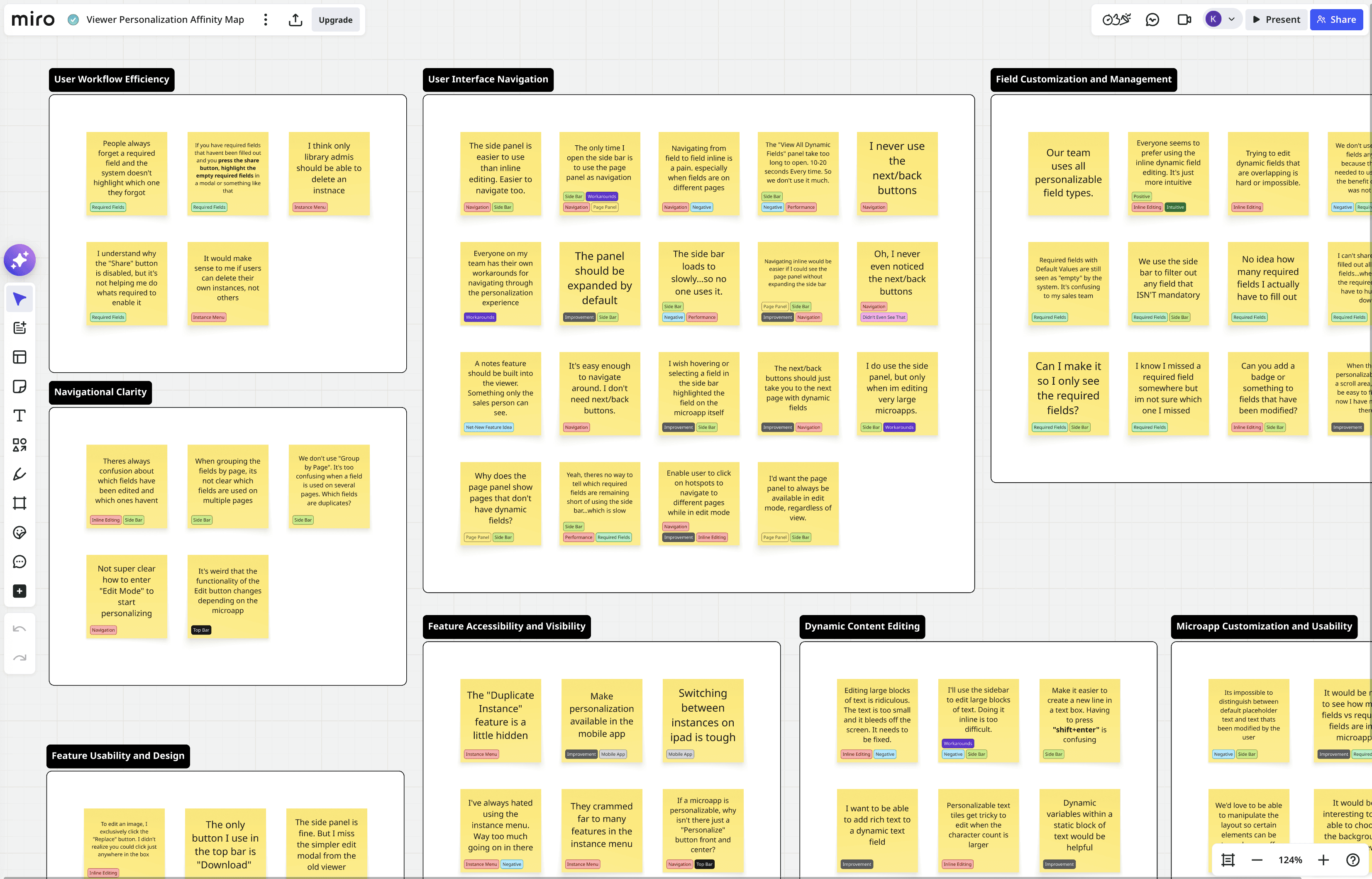
The interviews surfaced a lot of feedback. I organized everything in Miro, tagging each note by theme and sorting them into clusters.
"It takes too many clicks to get into edit mode."
"The 'View All Dynamic Fields' panel should be open by default to allow for quicker personalization."
"It should be easier to edit large blocks of text inline. What if it opened up in a modal?"
"The 'View All Dynamic Fields' panel takes too long to load. Typically 10-20 seconds."
"It should be it easier to edit large blocks of text inline. What if it opened up in a modal??
"The 'View All Dynamic Fields' panel should be open by default to allow for quicker editing."
"I want to be able to see just the instances I've created."
"Theres no way to tell which required fields are remaining. And I can't share till I've found them all"
"The next/prev page nav buttons are kind of useless to us. We never use them."
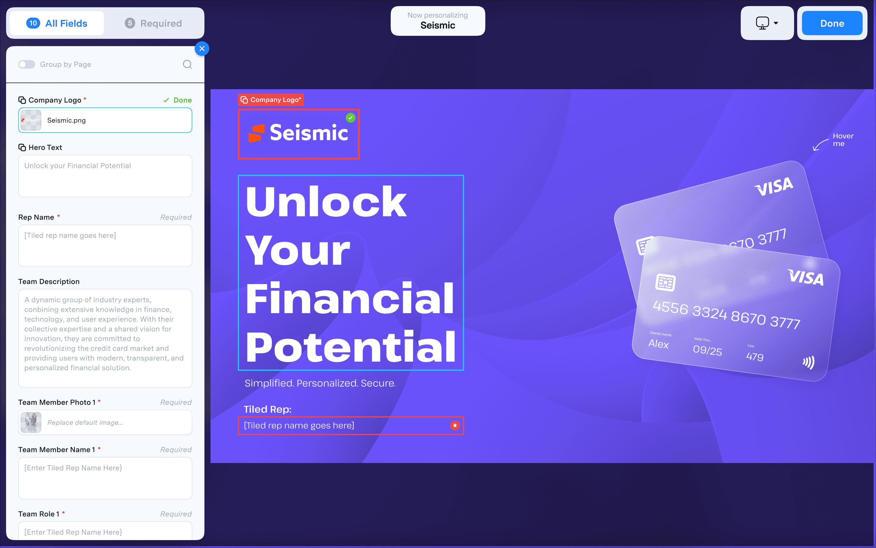
Five Core Problems Emerged…
01
Critical
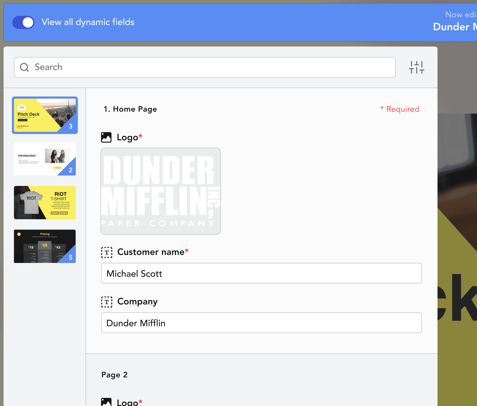
Required fields were "invisible" and blocking.
Users couldn't tell how many required fields existed, which ones remained, or where to find them. The system blocked sharing until all required fields were complete, but offered no help actually completing the task. Multiple participants described "hunting" for fields. One had stopped using required fields entirely because the effort wasn't worth the benefit.
"
I can't share until I've filled out all required fields...where are all the required fields? I have to hunt them down.
02
Navigation between fields was painful.
Moving from field to field, especially across pages, was cumbersome. The existing next/back buttons were either ignored or misunderstood. Several participants mentioned that their teams had developed their own workarounds for navigating the experience, which told me the core flow was broken.
High
"
Everyone on my team has their own workarounds for navigating through the personalization experience.
03
Field state is unclear.
Users couldn't distinguish between default placeholder text and content they'd already modified. They also couldn't tell which fields appeared on multiple pages, leading to duplicate edits or missed fields.
High
"
There's constant confusion about which fields have been edited and which ones haven't.
04
The instance menu was overloaded.
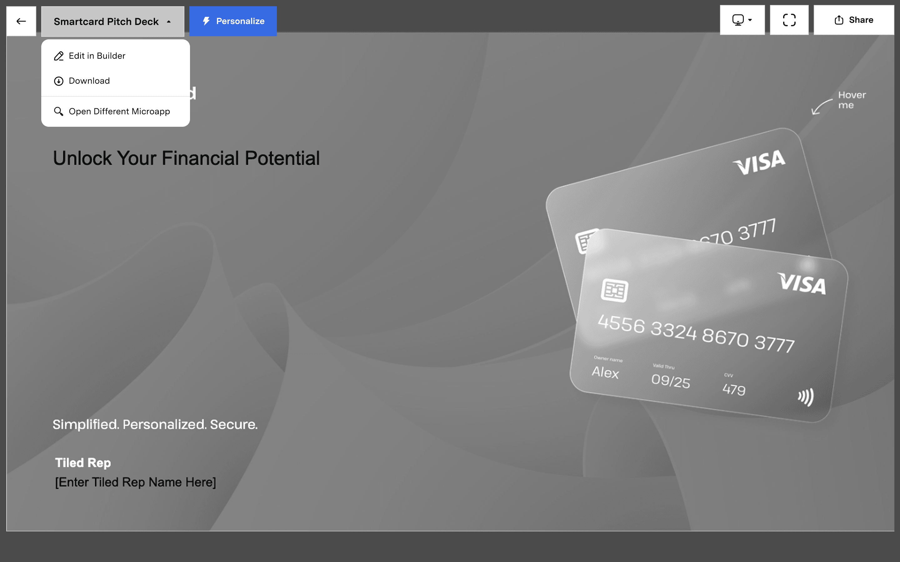
One menu was trying to handle microapp selection as well as instance creation and management. There was no clear focus. Users found it cluttered, and key actions were buried.
Medium
"
It feels like this menu is trying do too much. Either let me manage instances, or be a microapp selector. I don't think it needs to do both.
05
Performance undermined the sidebar.
The sidebar was the only place to see all fields at once, filter by required fields, or navigate large microapps. But it took 10 to 20 seconds to load. Some users avoided it entirely.
Medium
"
There's no way to tell which required fields are remaining short of using the side bar...which is slow.

Instance menu was overloaded
Microapp selection, instance management, and personalization controls all crammed into one menu.

Poor handling of required fields
Users couldn't share until all required fields were complete, but the system offered no indication of which ones remained or where to find them.
Field states are unclear
There is no visual distinction between defaul placeholder text and content modified by the user.
The initial design
With clear themes in hand, I moved into wireframes. The research had given us direction: surface required fields, simplify navigation, separate the overloaded instance menu, and provide clearer field states.
I explored several approaches, ran them through internal design reviews to tighten up the flows, then moved into high-fidelity comps that aligned with the visual language of our new Builder.
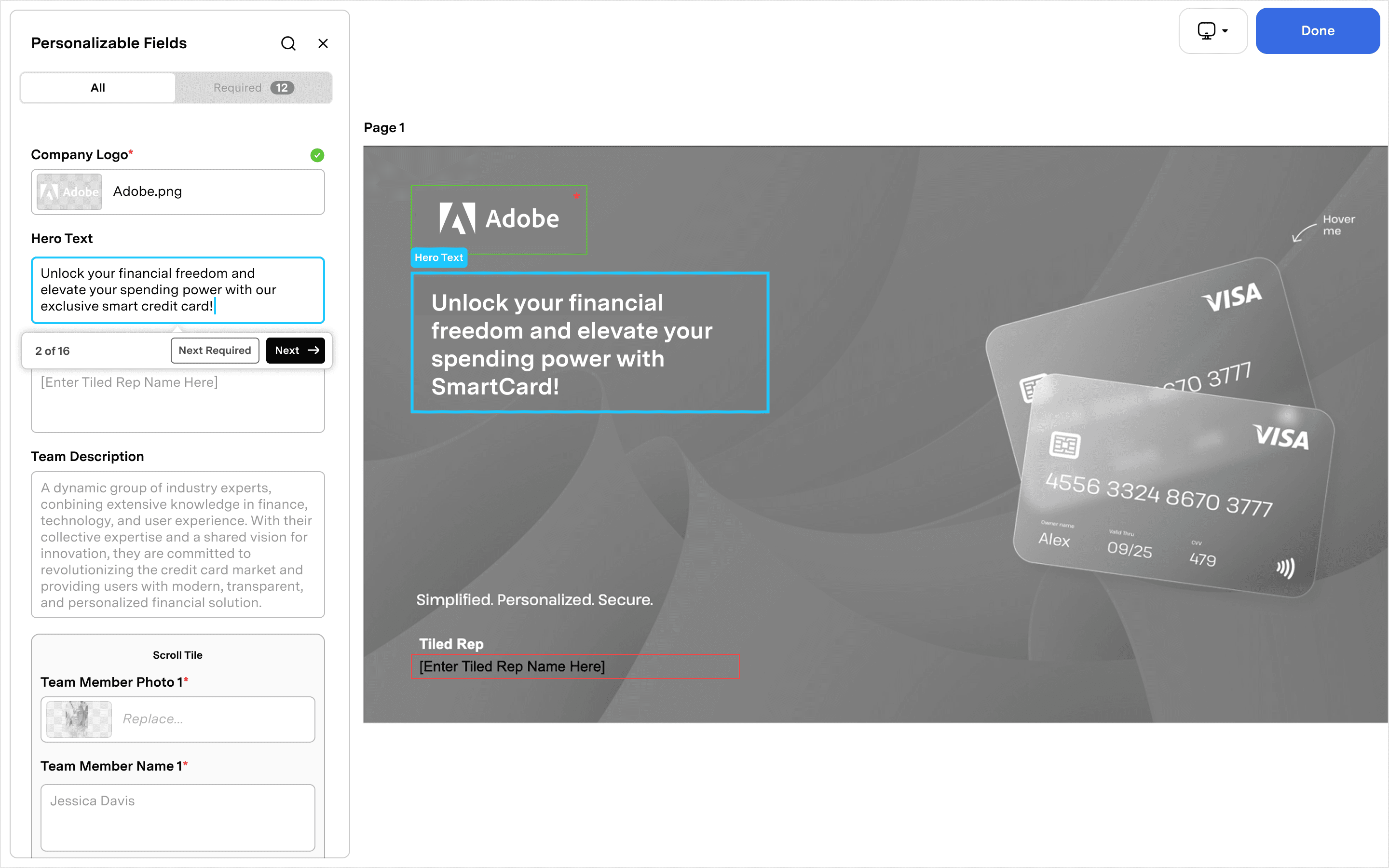
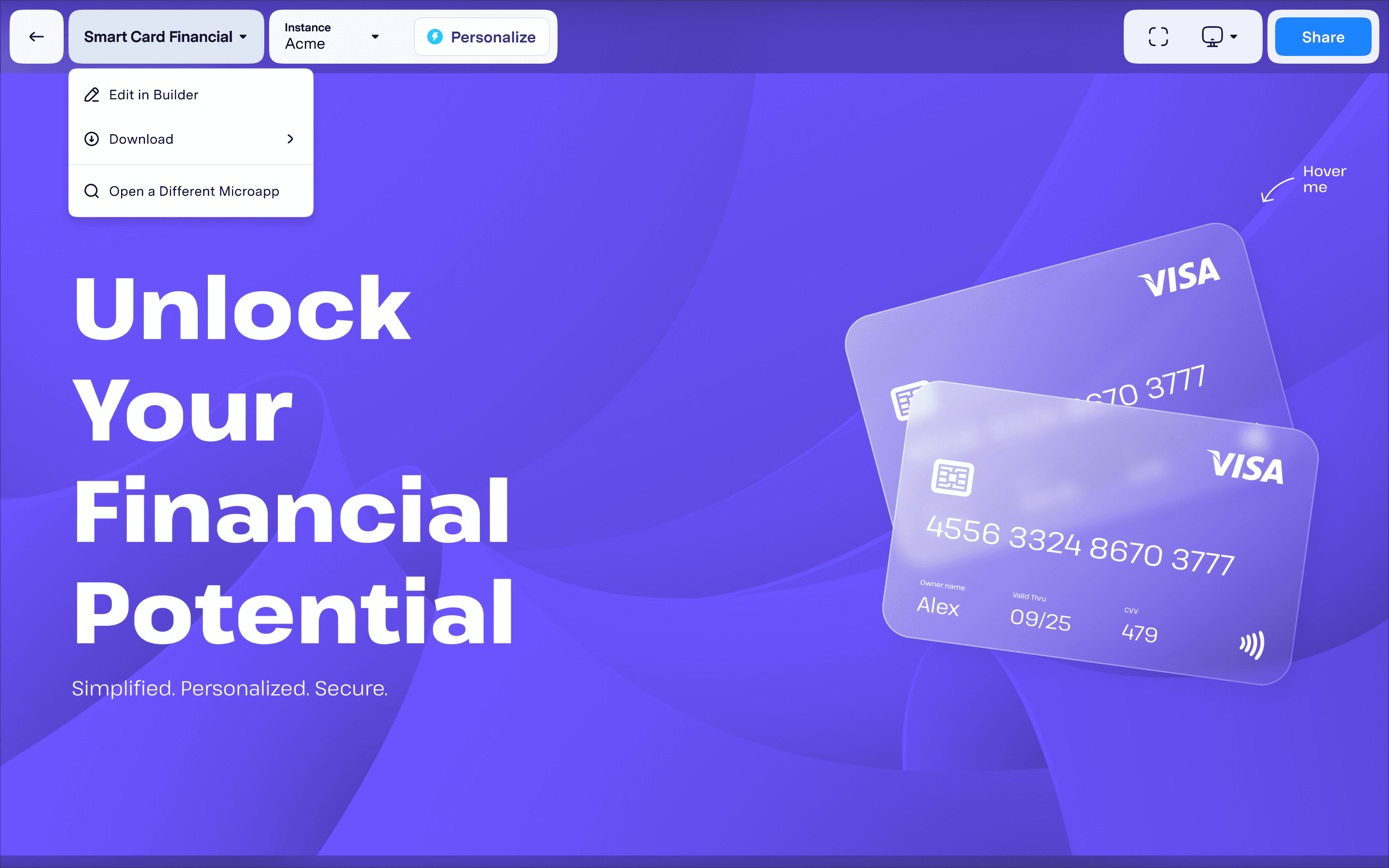
We felt confident. The designs addressed the pain points we'd heard in interviews. We handed off to engineering and shipped.
The misstep…
Two weeks after launch, our solutions engineer forwarded a Zoom call recording to myself and the Head of Product. It was a call with one of our bigger customers, the same one who had been vocal about personalization issues for months. We expected feedback. What we got was worse.
The reaction ranged from frustrated to genuinely upset. There were a few redeeming comments, but much of the call was critical. At one point, the customer asked if they could just revert to the old version.
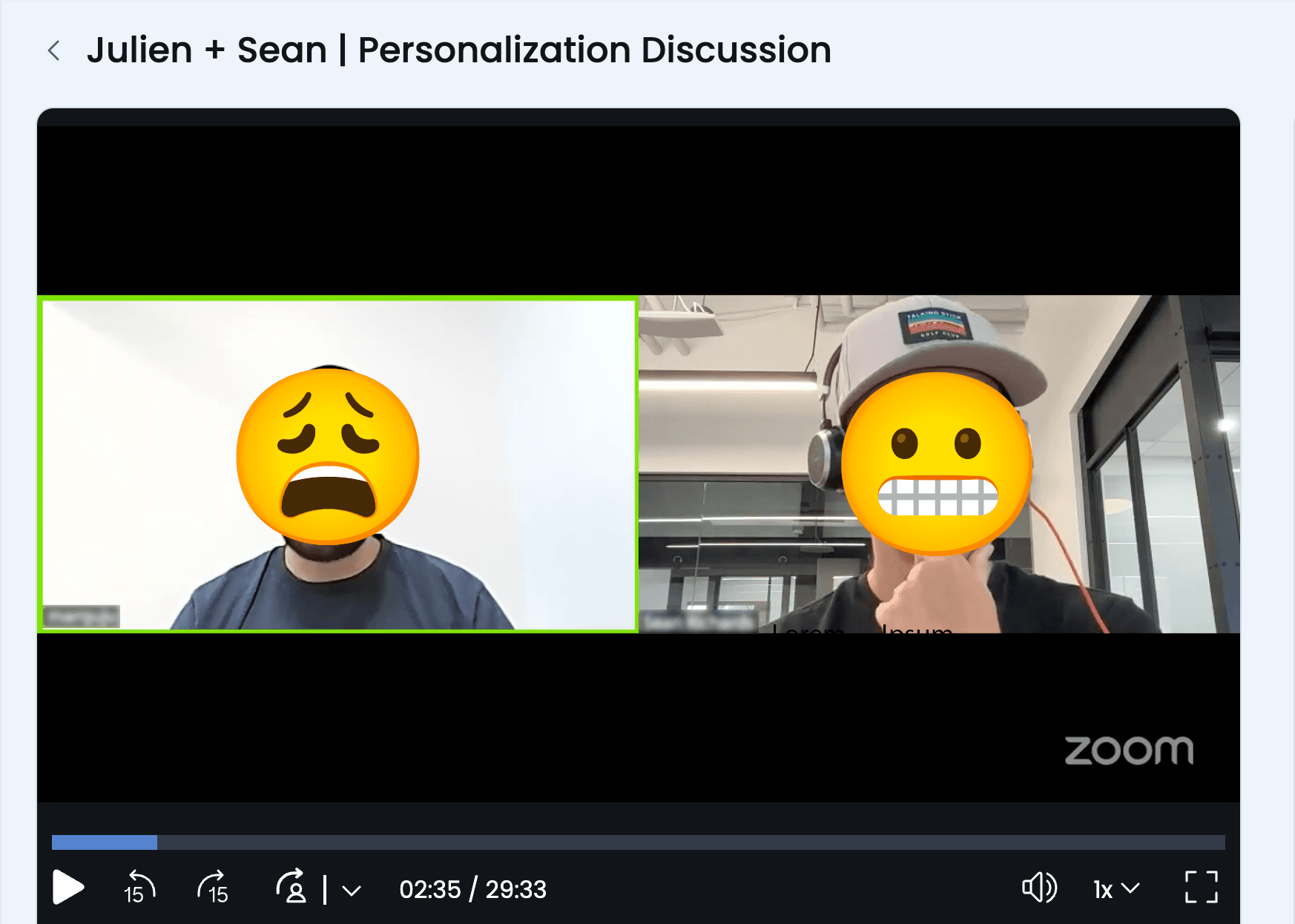
The Zoom call where it all went south. One of our biggest customer asked to revert to the old version.
We had made a critical mistake. The Q4 deadline and Seismic integration had created pressure to move fast, and we had. Too fast. After the initial interviews and synthesis, we moved straight from wireframes to high-fidelity comps to engineering handoff. We never validated our designs with users. We assumed the research had given us everything we needed, and we shipped on that assumption.
We owned up to it immediately and went into triage mode.
The recovery
I scheduled a call with the customer and made sure to include the Head of Product and our solutions engineer. The goal was simple: understand exactly where we went wrong and make a plan to fix it.
The call was productive. We learned that our miscalculations weren't as severe as the original Zoom call had suggested. The core direction was sound. But there were real points of friction we had introduced, fair feedback with clear solutions.
Armed with new information, I went back to my designs and started making adjustments. But this time, I wanted to feel confident in the UX before we touched engineering again. I turned to Figma Make.
I had been experimenting with it in small ways, learning how to get what I needed in as few prompts as possible. Those early explorations had shown me how powerful it could be: I could rebuild features from our app almost exactly to spec, add new interactions, and test ideas without requesting a dev resource. This was the moment to put that to use.
I rebuilt the updated personalization flow in Figma Make, creating a functional prototype that behaved like the real product. Instead of looking at a series of screens and imagining what it would feel like to click through, I could actually use it. I tested ideas in real time, refined interactions, and pressure-tested the experience before involving anyone else.
Once I had it in a good place, I ran internal user tests to verify we had addressed the pain points from the call. When we felt confident, we scheduled another session with the customer.
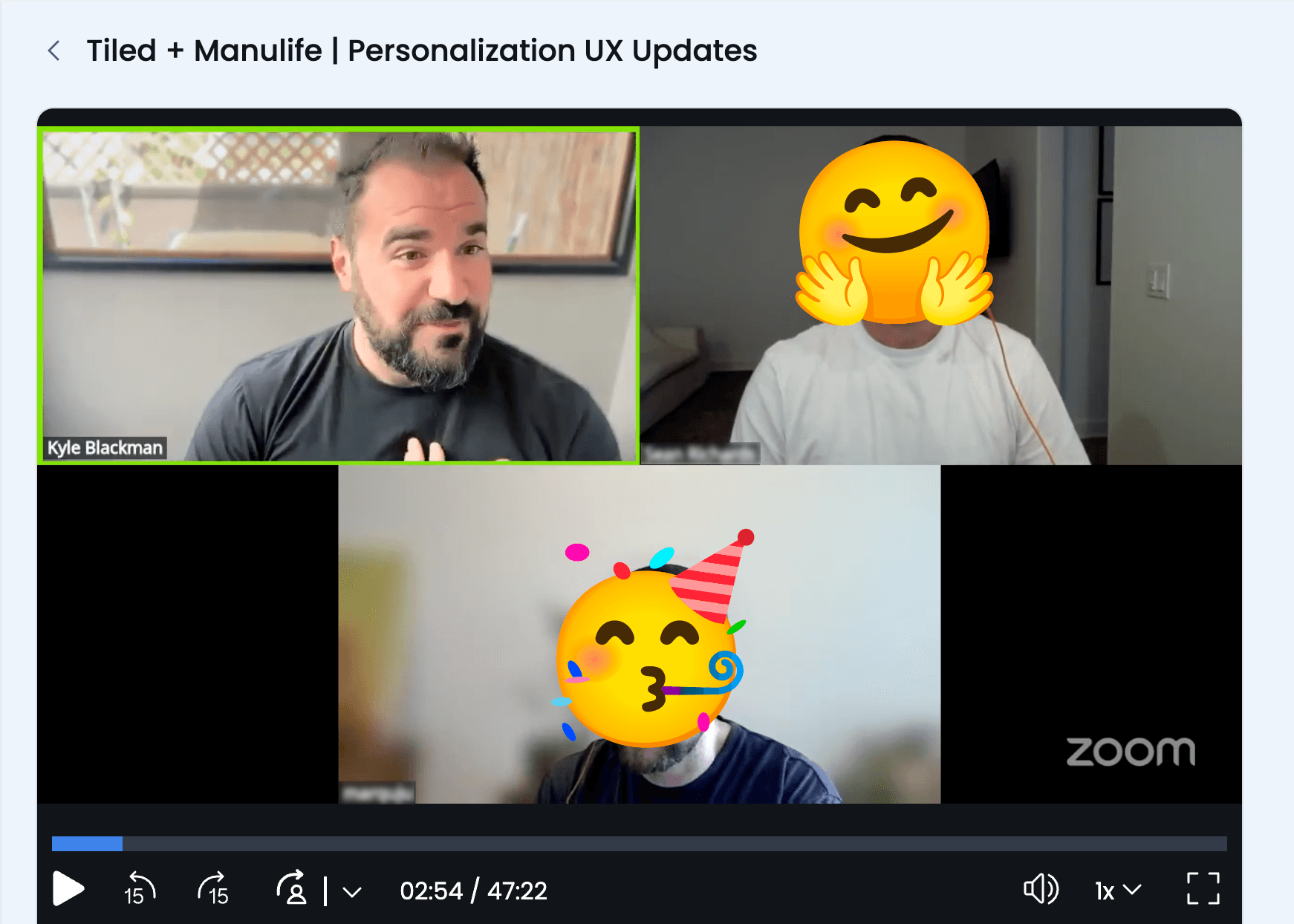
Course corrected. The same customer, now delighted with the revised experience.
During that call, I asked them to perform a series of tasks and instructed them to think aloud as they worked. They moved through the updated flow fluidly, as if they had been using it for years. There were sounds of delight: "Ah yes!" and "Yep, that's much much nicer."
As we wrapped up, the customer said: "This was great. Thanks for being so quick to solve these issues. Can these changes go out in this week's release?"
